NOTE: This post is a continuation of
Part 1 of “After Impressionism” exhibition at the National Gallery.
✲✲✲✲✲
Room 5 - New Voices: Barcelona & Brussels
This part of the exhibition turns towards other cities which began to emerge as focal points of new talent and new ideas.
The Automobile by Ramón Casas (1900)

Love it. For me, this painting was one of the highlights of exhibition. So striking and beautiful.
I love almost everything about it.
I like the drama - as if we’re caught in the headlights!! I love this lady - with her beauty, refined elegance and grace - commanding the steering-wheel with both hands. She is on her own; she needs no man to drive her. She doesn’t need a windshield. Her trench-coat is done up , and that’s enough for her. Her face turned slightly but her countenance bears the hint of a smile. In fact, I think she reminds me of my own mum when I was a young boy. In the 1900s, I expect the sight of a young lady driving - unaccompanied - was quite shocking. I knew nothing about Ramón Casas, but I’m especially delighted to see that a man painted this.
Also, I like the engulfing chocolatey-brown evanescence consuming the bottom 3/4s of the painting; and the contrast with the vivid green sky. The automobile feels like a beast, and those headlights glowing with an intensity and vividness that’s quite amazing. In fact, for a half-a-second, I wondered whether there were little light-bulbs in the painting. There is also the lovely sight of the Barcelona opera house.
✲✲✲
The White Peacock by Hermen Anglada Camarasa (1904)

Wow. Fascinating painting with mystery.
I like the golden sumptuousness of her dress and headdress; and there is something interesting & delicate in her posture and intense gaze. She seems slumped, fingers caressing the sides of her garden seat, as if in deep thought. A bouquet of pretty pink roses in her other hand. A glass of sherry or port rests unnoticed at her garden table. She also doesn’t seem to have noticed the revellers behind her. What is it that has her gripped?
Camarasa was a Catalan-Spanish painter and brought a Spanishy feel to the Parisian avant-garde scene.
 |
| Lovely brushstrokes, and that glass is so beautiful. |
✲✲✲
The Absinthe Drinker by Picasso (1901)

Not sure I really like this painting. Maybe that’s the intended effect?
But it is skilful; even in the awkward simplification of object here. I think the green jumper seems awkward and resembles actual skin (with the conspicuous outline of breasts?) and the red ‘skirt’ feels like some strange misshapen material (like a duvet perhaps?). The glass and bottle seem to be the only elegantly painted objects.
She has a contemplative face, head protruding, and arms crossed. It’s obvious that, in this painting, contrary to what they say; absinthe doesn’t makes the heart grow fonder.
Nevertheless, I can appreciate what is being presented here. Representing beauty with simplicity is not easy.
✲✲✲
Woman in the Loge by Picasso (1901)

I don’t like this either (which was in the gallery directly opposite the above Picasso).
Picasso probably mocking the Impressionist’s theatre-box subject.
According to the National Gallery:
Probably unfinished, it is painted in broad, rough strokes and at speed, using lurid colours that undermine any sense of glamour.
✲✲✲
Hardship by Isidre Nonell (1904)

Quite beautiful and moving. I really like this painting.
According to wikipedia:
Isidre Nonell i Monturiol was a Catalan artist known for his expressive portrayal of socially marginalized individuals in late 19th-century Barcelona
Here he depicts two emaciated women huddled together, wrapped up in blankets, against a wall. The tenderness with which they both rests their heads is evocative. The simple monochromatic palette is used here quite beautifully. I like the anonymity that the brushstrokes create in the lightly-dappled faces.
According to the National Gallery, he defied traditional painting through rigorous vertical brushstrokes
✲✲✲
Modesto Sánchez Ortiz by Santiago Rusiñol (1897)

I like this. It’s quite engaging; and painted carefully to evoke some depth.
The sitter was the director of the major Barcelona newspaper.
According to the National Gallery:
Rusiñol paints Ortiz confronting the viewer ... which establishes a dominant, sombre tonality for the picture. The intimation of a certain melancholy points to what was becoming Rusiñol’s primary concern: the depiction of poverty and drug addiction.
I do think there is something in that penetrating gaze with a certain wistfulness. The blue background is an effective contrast.
✲✲✲
Gustave Coquiot by Picasso (1901)

Quite similar to the ‘Woman at the Lodge’ painting (Above); and I don’t think I really like it. But, I do think composition is skilful.
Evening dress and with a mask-like smile. Behind him, on a stage, are bare-breasted belly-dancers gyrating. Merh. What does it mean? According to the National Gallery:
Picasso uses this backdrop of the western construction of the licentious ‘other’ to indicate Coquiot’s status as a supporter of the alternative world of the avant-garde.
✲✲✲
The Scheldt Upstream from Antwerp by Theo van Rysselberghe (1892)

Wow! Another show-stopper! I really like this painting.
I’ve previously discussed van Rysselberghe (and marvelled at his ‘Coastal Scene’), and this painting is even more mesmerizing. He was a Belgian painter of the Neo-Impressionists.
I love his expressive and strikingly vivid glowing sunset. The yellow and purple is magnificent. I feel happy even looking at this painting.
I also like the use of ‘simplified’ objects on a clear landscape which adds to the dramatic and emotional aspect of the vista. I’ve also noticed the feeling of calmness and tranquillity imparted by a painting through its use of unruffled reflections in the water (e.g. through Turner’s “War. The Exile and the Rock Limpet” or Claude Monet’s “The Museum at Le Havre”)
As always, I love to take a closer look at the dot magic:
✲✲✲
Portrait of Alice Sethe by Theo van Rysselberghe (1888)

This painting is huge, almost life size; and really quite beautiful.
The way the light gleams of the folds of her elegant dress gives her a shimmering effect. I like the way one of her feet sticks out. I also like her posture and the quiet poise in both her wrist and her face.
The elbow-gloves, dress with the waist-knot (is she wearing a corset?), golden furnishing, lovely hair create a timeless elegant look.
The pointillism is really astounding:
✲✲✲
The Eve of the Strike (Dark Clouds) by Jan Toorop (1888)

Very evocative depiction of misery and destitution.
This is the first I’ve come across the Dutch-Indonesian artist Jan Toroop who became associated with Neo-Impressionism.
In this painting, we see a despairing miner beside his wife and their infant child. This painting was inspired by the accounts of the hardship suffered by families in the Belgian coalfields.
There seem to be several layers of beautiful tonality to the painting: pink-orange building silhouettes, an opalescent river, the darker hues surrounding pour family and people toiling in the field just behind them. The pointillism takes on an added intensity with the snow-like yellowness which saturates the painting.
Our pity and distress is heightened by his hands upraised & dejected expression, no shoes or socks, and his wife’s vacant expression.
✲✲✲
Astonishment of the Mask Wouse by James Ensor (1889)

This is a puzzling painting by a Flemish painter.
Nevertheless, the painting is a testament to anti-naturalist symbolism.
A ‘wouse’ means a ‘significant other’. The masked woman gestures towards a heap of masquerade figures and musical instruments. I’m not sure I fully appreciate the purport (if there was one).
I don’t think I like this painting much.
✲✲✲✲✲
Room 6 - New Voices: Vienna & Berlin
✲✲✲
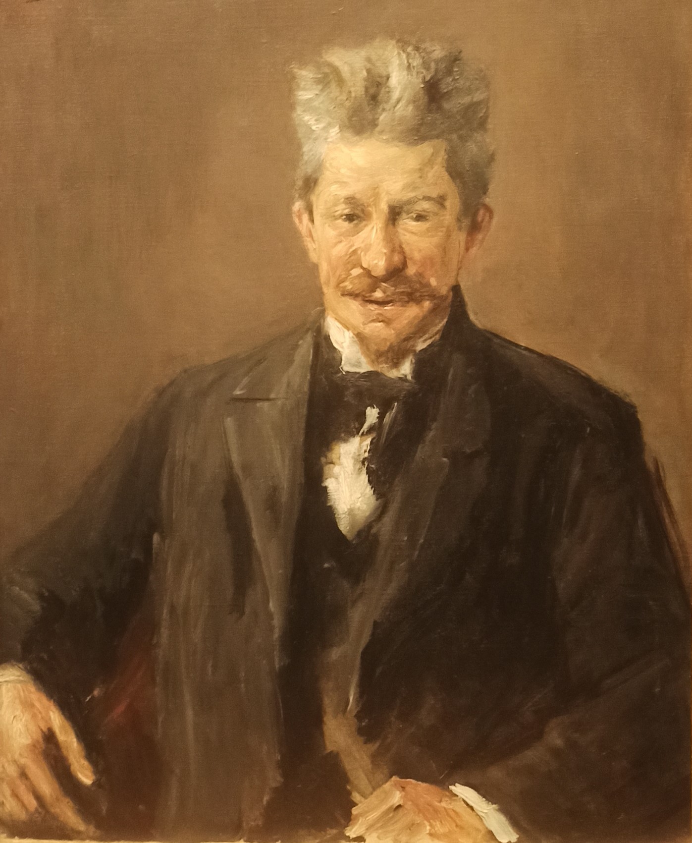
Georg Brandes by Max Liebermann (1901)

Beautiful.
I love the delicate brushwork around his face which seems to radiate a pensiveness and a thoughtful gaze; perhaps even the hint of a misfortune or an affliction. I quite like his rather large nose. The small pinched eyes, I think, suggest a matured perspective on life. And what an amazing hair style; electric!.
The balance and harmony of colours is wonderful and focuses the attention on the sitter. Mind you, I think it would still work with a Gauguin-inspired red or green non-naturalistic panorama.
The sitter is Georg Brandes. He was an influential Danish literary historian and philosopher who supported innovative European literature.
 |
| An exploring brushwork. |
✲✲✲
Danae by Max Slevogt (1895)

Incredible painting. Definitely repellent!
I’d never heard of this German artist Slevogt. An interesting fact is that this painting was initially rejected at the annual Munich exhibition in 1895. Max Slevogt was a German Impressionist painter. Together with Lovis Corinth and Max Liebermann, he was one of the foremost representatives in Germany of the plein air style.
Danae comes from Greek mythology. She is the daughter of the king of Argos, Acrisius. An oracle foretold that she would bear a son who would kill her father. Zeus visited her in the form of a shower of gold and she conceived Perseus, who killed Acrisius by accident.
This painting is definitely discomforting; but beautifully painted. The coins take the form of a bribery to have sex with the nymph Danae. She is made to resemble a corpse slightly. The hands behind her head is a bit perplexing. That would suggest that she is alive. Perhaps alive, but made to be death-like. The greed and avarice of the maid is repellent (as per her sunken eyes and general physiognomy).
It’s definitely a stirring painting.
✲✲✲
Children by the Pond, The Garden in Godramstein by Max Slevogt (1909)

Wonderful.
I like the heavy emphatic brushwork which creates an engrossing surface texture, and the general bright tones which give this wonderful garden scene a charming feel.
✲✲✲
Perseus and Andromeda by Lovis Corinth (1900)

I do like this painting.
It is pretty huge and depicts ancient Greek mythology.
Princess Andromeda is depicted by Corinth as a fierce and unidealised nude. She stands atop the slain monster from which Perseus has liberated her. I think Corinth makes her the true hero of this painting; while Perseus is clad entirely in armour. I like the depiction of this woman in the epic form; and it is not clear whether she wants to be clothed by P. Her liberation?
According to the National Gallery, Corinth intertwined classical mythology with impressionism into forceful ‘modern Baroque’. From Craftestan blog:
His artistic genius lay in his ability to breathe new life into classic subjects, translating them into a language that resonated with the contemporary viewer. This innovative approach led him to the creation of his unique style, referred to as the ‘modern Baroque.’ The ‘modern Baroque’ represents a skillful amalgamation of the dramatic, richly detailed Baroque style with the vivid colours, expressiveness, and emotional intensity of modern movements.
✲✲✲
Nana, Female Nude by Lovis Corinth (1911)

Wow!
I don’t think I’ve ever seen a painting so sensual. I was almost blushing taking this photo.
I have since discovered that Lovis Corinth painted lots of nudes and seems to have been fascinated by the sensual depiction of flesh. His contemporaries even called him “Fleischmaler” (the flesh painter).
In this painting, he presents a woman’s body in such a high-keyed tones (red, yellow, and orange) with thick buildup of paint which creates a very life-like oleaginous vibrancy. It’s genuinely captivating. You feel you can almost touch the painting’s object. And also, she is genuinely beautiful.
And the way this woman thrusts herself forward is also alluring. The way her delicate arms cross themselves make her seem graceful, swan-like. The way her body is positioned forces us to notice everything about her. Indeed, her physical presence in the painting is all-consuming; and the beautiful ornate curtains make her glow with a flame.
Also, her expression seems remote; and even distracted. As if giving us, the viewer, permission.
Incredible. Another show-stopper.
✲✲✲✲✲
Room 7 - New Terrains 1: Expressionism and primitivism
This room focuses on:
- Expressionist art - from 1905 by group, Die Brücke (The Bridge) from Dresden.
- ‘Folk’ art and the work of Henri Rousseau - in changing and constructed definition of ‘primitivism’.
The Death Bed by Edvard Munch (1895)

A beautiful and powerful expression of grief and loss.
I knew v. little about Edvard Munch before this exhibition. In 1877, Edvard’s beloved sister Johanne Sophie died from tuberculosis. His mother had already died; but his sister’s death was the defining catastrophe of Edvard’s life. He was aged 13.
In this evocative painting, I think we get a contrast of powerful colours. His whole family gathered around the bed and bound together by an enveloping and enshrouding darkness (shadow) from which they are separated from his sister. This sanguine blood-like red is symbolic of sacrifice and danger. Black, I assume, with depression.
✲✲✲
Cabbage Field by Edvard Munch (1915)

This painting is interesting with its vibrant colours.
After a bit of reading on the Norwegian artist Munch, he seems to be a fascinating - and underrated - artist. The popularity of his Scream has, I suspect, done a disservice to his ouvre. For me, I really would like to go to the Munch Museum in Oslo.
According to the gallery this painting pre-dated his darker compositions:
Munch suffered a major breakdown in 1908 that led him to leave Berlin for a clinic in Copenhagen prior to returning permanently to Norway. This landscape of a cabbage field - seen from a low viewpoint - is typical of the vibrant, more overtly gestural brushwork and less haunted subject matter which he began to explore in the years following.
✲✲✲
Consul Christen Sandberg by Edvard Munch (1901)

Not sure whether I really warm to this painting. But it is beautifully painted. (Maybe I don’t want to be painted so plump).
Here we see bold strokes of paint for a full-length depiction of a rather rotund gentleman, hands in pockets, respectably-dressed, lovely shoes, in a pretty room, with a generally agreeable disposition.
The subject is the Norwegian naval officer Christen Sandberg who was a family friend.
 |
| Nice hint of a smile, some redness to the cheeks, warm eyes. |
✲✲✲
Portrait of Adele Bloch-Bauer II by Gustav Klimt (1912)

A charming painting to please a socialite.
Adele Bloch-Bauer was a Viennese socialite and patron of the arts.
An art nouveau painting (somewhere between modernism and neoclassicism) full of sinuous, intricate, curvy and decorative designs; and flowery.
The other painting is golden Byzantine-style; whereas here, I think, Bloch-Bauer is depicted in an ornate surface of beauty & flowers. A big large hat, adorned by flowers, Chinese fabrics and a lovely carpet.
 |
| An inscrutable face? |
✲✲✲
The Artist’s Mother by Broncia Koller-Pinell (1907)

Lovely.
Broncia Koller-Pinell was a Jewish Austrian expressionist painter. Although not admitted to Vienna’s Academy of Fine Arts; she came from a wealthy home which allowed her to learn privately. At 18, after having studied in Vienna, she moved to Munich to train for a further 5 years. In 1903, she moved with her husband and two children to Vienna. She then inherited the family house in Vienna, where she set up a salon for Vienna’s artistic avant-garde. She was close to Gustav Klimt, Joseph Hoffmann and Koloman Moser.
In this painting, her mother is sitting outside with her needlework. I think the flat gold background and the flat flowers are a nod to Klimt’s influence. I like the chequered effect in the geometric gaps in the wicker chair. Nevertheless, there is a naturalistic appearance to her mother’s face; from the ears, double-chin, hair in a bun.
 |
| A sweetness to the face. |
As the gallery has said, she is not well-known:
Koller-Pinell was well-known in her day and played an active part in the artistic community, but few are aware of her work today.
✲✲✲
Seated Girl with a White Shirt and Standing Nude Girl by Paula Modersohn-Becker (1906)

A sweet and touching painting.
Expressive and simplified. A girl leaning forward to comfort her sister.
Paula Modersohn-Becker was a German female artist. According to the gallery:
It was through her encounters with art and artists in Paris (ranging from Pierre Puvis de Chavannes, the Nabis and Henri Rousseau to Pablo Picasso) that Modersohn-Becker found her own pictorial language to depict a world of private, predominantly female experience.
I like the charm and affection of the painting - but I am not sure whether I like Modersohn-Becker’s painting style. Maybe I do. I think I need more exposure to her work.
✲✲✲
Joseph Brummer by Henri Rousseau (1909)

I’ve already covered this artist in his painting ‘Surprised!’. I really like that painting; but this one ... I don’t think so.
The sitter was Joseph Brummer; a Hungarian-born art dealer in Paris.
I think this art is important for historical reasons; but otherwise I can’t say I really like it. According to the gallery:
Rousseau’s so-called ‘naïve’ style, had become much admired among artists in France and America ... To them, he was considered a ‘primitive’, who was thought to be self-taught and hence capable of ‘instinctive’ creativity. His art was both deliberate and highly sophisticated. Picasso organised a banquet in his honour in 1908 attended by the luminaries of the avant-garde.
✲✲✲
Young Finnish Woman by Sonia Delaunay (1907)

I like this. It feels so contemporary.
A young Finnish model is depicted through simplified flattened forms and vivid vibrant colours. I think we can see Gauguin’s influence, but not sure about the difference between expressionism and Fauvism.
These portraits are especially expressionist - in the sense of expressing the subject’s state of mind (as opposed to the viewer or artist’s feelings). Those tinges of green are, I think, reminiscent of ill-feeling (perhaps jealously)? and the red perhaps embarrassment? Either way, this is not a comforting face. It’s also confirmed by those flared nostrils, furrowed eyebrows, and tightened lips.
Sonia Delaunay is a fascinating artist. Born in Russia (Odessa), she was trained in Germany and came to Paris in 1905. She was part of a growing number of independent and internationally mobile women artists, of the avant-garde, who contributed to early 20th-century art. Delaunay was one of the pioneers of entire abstraction. She was also Jewish and came from a relatively well-off family.
✲✲✲
Break in the Dyke by Karl Schmidt-Rottluff (1910)

A broken dyke is depicted. The subject is expressive of the chaos and intense force.
Chaos is what I see in the strong waves of red engulfing the whole painting and pushing out the sides of green verdure and patches of yellow. The oceanic-blue is breaking in. Intense colours, a clear departure of depicting reality, simplified forms, and bold outlines. Schmidt-Rottluff was a member of Die Brücke (The Bridge) group. As per the gallery, we see the influence of the non-naturalism of both Gauguin and van Gogh.
Interesting work. Not sure how I feel about this painting though.
✲✲✲✲✲
Room 8 - New Terrains II: Fauvism and cubism
This part of the exhibition concern two major movements emerging in Paris at the early 20th century.
- Fauvism - the word ‘Fauves’ (i.e. ‘wild beasts’) comes from the 1905 exhibition of the Salon d’Automne where Henri Matisse and André Derain marked out for their non-naturalistic use of colour and deconstruction techniques.
- Cubism - Georges Braque & Pablo Picasso with their analytical approach to volume and the simplification of form (inspired by Cezanne, ancient Iberian art and African art). After 1911, they were called ‘Cubists’ by the press.
- Fauvism and Cubism pushed art toward abstraction.
- But complete elimination of subject-matter was propelled by, among others, Piet Mondriaan and Wassily Kandinsky.
Wilhelm Uhde by Picasso (1910)

Amazing.
The subject is first husband of Sonia Delaunay, Wilhelm Uhde. He was an art dealer & art critic.
I think it’s fascinating how light and shadow interact across the folded multitude of monochrome facets of his body. It’s amazing how he’s able to bring forth a person via fragmented surfaces. Mind you, Uhde’s most notable features emerge via meticulous aspects (e.g. tightly-sealed lips, parting of the hair etc).
✲✲✲
The Castle at La Roche-Guyon by Georges Braque (1909)

Interesting; but not particularly beautiful.
Inspired by Cezanne (following his retrospective after Cezanne’s death), Braque adapted Cezanne’s directional brushstrokes. In this view of a village and castle, the objects are rendered in highly-simplified forms.
It seems Braque was initially painting in highly-coloured Fauvist influence, but then began reducing his palette to paint his landscapes.
Interesting evolution.
✲✲✲
Nude Combing her Hair by Picasso (1906)

Another fascinating picasso.
The original was Titian ‘Venus Anadyomene’ (i.e. Venus rising from the Sea):
As per the National Gallery; this painting owes a nod to Cezanne’s Bathers which I hadn’t initially realized:
However, the mask-like face and thick-set cylindrical body reveal Picasso’s debt to Cezanne’s depictions of bathers and to his own fascination with ancient Iberian sculpture. Both went on to inform his ground-breaking Demoiselles d’Avignon, an important step toward Cubism.
✲✲✲
L’Estaque by André Derain (1906)

This has grown on me. Initially, I didn’t really like it.
Apart from the high-key tones of the landscape is the white separating elements of the painting - and pointing out the bare canvass beneath. It kind of tears at the three-dimensional recession of the painting. But it also quite balances out the miscellany of colours (in a beautiful sort of way).
✲✲✲
Woman with Pears by Picasso (1909)

I quite like this.
The object of this painting is Picasso’s muse Fernande Olivier.
The use of disparate palettes separates her from the green landscape, the grey room, and brown chair.
Fernande’s face has been invested with such punctilious and careful delineation especially her eyes which have a mirror-like reflective illusion quality. Her features have been carved to create these sharp-edged facets. The depth of the cubist delinating is made possible, I think, via light and shadowing.
It’s very skilful; and reminds me of the scientific approach of the neo-impressionists.
✲✲✲
Madame Matisse in a Kimono by André Derain (1905)

Beautiful. Like falling into a dream.
Apparently, Derain spent the summer of 1905 on the Mediterranean with Matisse and his family.
In this portrait, Matisse’s wife (Amélie) is painted in a kimono dress. Such intense and bold colours (esp. those green swirls) make for an enchanting scene. It’s really a very beautiful effect. Against which, he paints a rather modest and reserved Mrs Matisse.
 |
| I like the brushwork around her face; and the dot on her nose. |
✲✲✲
The Dance by André Derain (1906)

This must have been shocking when it was painted.
I am not sure I really enjoy this - as much as Mrs Matisse.
Either way, we get a flattened and abstract painting. Ornately decorated and stylized figures dancing. I expect the green snakes (one of which bites a man) is a symbol of danger. Since the tree has grapes as opposed to apples, it can’t be a biblical reference. The seated person might as be floating. I like the yellow and blue background hues that divide the painting.
As the National Gallery pointed out, the influences on this painting are wider than the Western tradition:
Its inspiration drawn from beyond the canon of Western art Alongside references to Paul Gauguin, Derain freely maxed sources such as Japanese reliefs, Romanesque sculpture, and West Central African art from French-administered Gabon
✲✲✲
Interior with a Young Girl (Girl Reading) by Henri Matisse (1905)

Beautiful.
Matisse painted his daughter Marguerite and bathed her in unrestrained enthusiasm and joy - i.e. the exuberant colours and decorative objects (bowl of fruits, flowers in vases, jug of water on table etc) which attest to that. There’s a sweetness to Marguerite with her hand-on-head and attention focused on her studies.
According to the gallery, the large dabs on the tablecloth are the remaining elements of neo-impressionism (having worked with Paul Signac in 1904); but the kaleidoscopic-effect of colouring is the application of his new Fauvism.
 |
| So much colour. |
✲✲✲
Greta Moll by Henri Matisse (1908)

Quite pretty, but not as vibrant as the painting with his daughter.
It’s a respectable painting. Depicting the portrait object with elegance and class. She has wonderful jewellery, her body is in a relaxed stance, and she is gazing into the distance. I like the cushion warmth in the subtle tones of red, and the depth of illusion is denied by having the background melt with her shirt.
✲✲✲
The Riverbank by Henri Matisse

Not sure whether I really like this.
This is the fishing village of Collioure on the Mediterranean.
Apart from the classic lack of depth to this painting; according to the National Gallery:
The muted palette of purples, lilacs, greens and yellows in this distilled view from a shaded riverbank herald a period in which Matisse began to use increasingly flattened areas of colour that privileged decoration over direct representation.
 |
| I do like this little detail, especially the lady’s hat. |
✲✲✲
 |
| Arriving at the National Gallery, from the side. |