NOTE: This is part 1. Part 2 here.
This blog post is my write-up on the “After Impressionism: Inventing Modern Art” at The National Gallery in London.
It was incredible. A fabulous blockbuster exhibition & full of the big-hitters of post-impressionism.
What’s incredible is the sheer number of paintings loaned to the exhibition which normally sit in some “private collection”. So, it will be many years before we get a chance to see them again in London.
The focus of the exhibition is the period of time between the last impressionist exhibition in Paris (1886) to the start of WWI (1914). That’s around 30 years. It charts the development across Paris - but also in Brussels, Barcelona, Vienna and Berlin.
✲✲✲✲✲
Room 1 – Paul Cezanne and Auguste Rodin (1880s–1900s)
✲✲✲
Bathers by Paul Cezanne (1894)

Interesting, striking and quite beautiful.
Two important things stand out. (1) the nudity of all the ladies at the foreground under blue-green foliage and (2) the fact that their bodies/shapes/outlines and colours seem to blend into the environment.
This is probably a reference to the idealized beauty of the Renaissance but, in Cezanne’s work, these ladies are rather bulging with a minimalist/simplified body. I like how the lady walking into the painting (at the left-hand side) seems to have limbs that resemble a tree. There bodies seem to have blended simple tones. They have no discernible human facial expression. The people kind of fold into and out of each other - like escarpments and ridges. That walking figure is all rectangles and square with straight-lines; and all with earthy foresty shades of hue.
With the benefit of cubism (which I think we can see the origins here); I think we can it for granted just how shocking this painting must have been - and why so many artists were so influenced by Cezanne.
✲✲✲
The Sacred Grove by Pierre Puvis de Chavannes

Technically, this is the first painting that greats the visitor - and, for me, I was a bit deflated by it. I wasn’t expecting to see this.
According to arcadiandreams:
Puvis is not working in the conventional allegorical manner; he is more interested in creating a mood of reflection. The viewer is presented with a dreamscape exuding ‘the deep peace of serene solitude’. Puvis is not concerned with precise definitions, he is presenting us with a general evocation of tranquility – a decorative arrangement of figures (seemingly engaged in some sort of gestural dance) within a serene landscape.
We get a flattened landscape, a golden unruffled lake and various togas and artists/philosophers. It doesn’t feel like the post-impressionists.
Beyond that, I’m not really sure whether I’m really drawn to this painting.
✲✲✲
Monument to Balzac by Auguste Rodin (1898)

An homage to Honore de Balzac.
Here, Rodin was moving beyond naturalistic representation and likeness to give a forceful personality. Balzac’s arms are folded, and the deep hollows in his eyes suggest an inner contemplation.
According to the gallery, this was rejected in its day. Therefore, it must have also been quite shocking.
✲✲✲✲✲
Room 2 - Pivotal Figures: Cezanne, van Gogh & Gauguin
✲✲✲
- These three men propelled avant-garde art in the 20th century.
- They challenged the requirement for art to be naturalistic.
Madame Cezanne in a Red Dress by Cezanne (1888)

This is such a beautiful painting of Mrs Cezanne.
There is a certain sweet humbleness about her that is captured. The minimalist and simplified structure of her coat-dress and especially the different shades of scarlet-red and how it fuses with brushstrokes of lighter iridescence makes it really stand-out and shine. I think there’s something very sweet about her exposed hands and upturned sleeves - and especially (I think) the little flowers at the end of his fingers.
The whole room seems to be moving. The curtains are plush and opulent (with those fruits) and she sits on a golden throne. I think this is supposed to mess with our sense of dimension to the painting. According to the National Gallery:
Cezanne’s insistence on the rectangular forms of the chair back, fireplace and mirror frame in top left corner also draw attention to the flat surface of the picture plane.
I really love this painting because I think it’s full of affection.
✲✲✲
Sugar Bowl, Pears, and Tablecloth by Cezanne

Have you ever seen such beautiful fruit? They sort of radiate beauty and succulence in their vivid colour.
I think Cezanne has really captured that sweet and fleshy surface and structure of the fruits.
But, as the gallery points out, Cezanne doesn’t care to place them on the table in any realistic fashion. They exist almost suspended from reality. The cloth and plate don’t look as though they interact. And that lemon on its own has its own brown halo of table-ness. Mind you, there does seem to be a shadow effect on the fruit across the table (thus, affecting a natural environment acting on the object).
Beautiful. I like it a lot.
✲✲✲
Mont Sainte-Victoire by Cezanne (1902)

I’m not sure what to think about this painting. It makes me think and wonder - and I think, perhaps, that’s the object.
It’s a classic Cezanne! He sits with Gauguin, Van Gogh and Seurat as the post-impressionists even though he started off in the impressionist exhibitions. Although this painting has the feel of impressionism; this motif was revised and polished - i.e. not en plein air.
Every aspect of his view of Provence has been deconstructed with its own volumetric depth. We’ve departed from conventional central linear perspective. It’s as if the painting’s purpose is - not to represent reality- but to expose the underlying structure of reality itself - i.e. the physicality of the medium. All the trees, waterways, mountains, skyline are blocks of brushstrokes creating a faceted surface. Quite often the facets melt and elide; e.g. the side of the mountains are free-floating.
Very interesting. If this painting is ‘difficult’ today; goodness knows what reaction it must have engendered in its day.
✲✲✲
Ambroise Vollard by Cezanne (1899)

Ambroise Vollard was an art dealer who knew Cezanne for many years. He was a pioneer dealer and patron of the avant-garde and shaped many artists careers and gave Cezanne (and van Gogh and Picasso etc.) an international audience.
In this portraiture, Cezanne paints with his characteristic brushwork of patches of similar sizes (in parallel or diagonal) and treats all surfaces (people and environment) as though they are the same. I do love the relationship between the patches of similar and odd colours (which stand out) and the attempt to create volume and a certain character (that je ne sais quoi - e.g. the green brushstroke on Vollard’s forehead). If one looks closely, the depth collapses; and yet from afar the brushstrokes tend to work by creating an illusion. I think Cezanne wants us to be aware of the illusion. He gives us the brushstrokes (as opposed to the high-finish of classical painting).
And Vollard seems serious and modest. Legs crossed with a book in hand, and in a rather chic brown suit. It’s quite complimentary to him.
I like it.
✲✲✲
Homage to Cezanne by Maurice Denis (1900)
It’s sometimes hard to capture a painting with the bright museum lights. Thus, this annoying sheen. :/
This painting is an homage to Cezanne and his influence on the newer generation of painters. It depicts a group of artists gathered around one of his still-lifes.
The scene is in Ambroise Vollard’s Paris gallery, and I think he makes an appearance in it.
✲✲✲
Woman from Arles by Vincent van Gogh

Lovely. Something very charming, vulnerable and perhaps melancholic in this painting.
I watched a documentary on van Gogh and he regularly painted this lady in the South of France (Arles). Her name is Madame Ginoux, and was based on a drawing left behind by Gauguin when he had stayed at Van Gogh’s lodgings.
The use of limited number of colours (some of which are vivid) makes for a forceful painting. We are drawn into her eyes, and her tired skinny hand. She seems to be in a quiet contemplative brooding pose. I like the addition of her books on the table. She may as well be at her dinning-room table before bedtime; reminiscing.
I like really like this painting. It’s very sweet
✲✲✲
Snow-Covered Field with a Harrow (after Millet) by Vincent van Gogh (1890)

Something poignant and mournful in this painting.
Little signs of any resplendence, little animating warmth and colour, few signs of any plantation and vegetation, a tiller and some farming instruments abandoned in the middle of the field, tress with no branches, and birds flying off - away - into the distance.
Painted while van Gogh was at the asylum at St Remy.
 |
| Two little black birds (crows?) resting on the tiller. |
✲✲✲
Enclosed Field with Ploughman by Vincent van Gogh

Just wonderful. What an exquisite sight, uplifting even.
I love the sight of the farmer and his beautiful black stallion working the field; and not to mention that rustic & charming little cottage in the distance.
I think van Gogh painted this while he was at St Remy. I like how the horse seems to have pivoted its head to look at us. And that glowing sun, it seems to radiate and dazzle our senses. Have you ever seen such a beautiful sun? I love how van Gogh can take a simple mundane aspect of life and then augment their intensity and power. He gives mother nature magic.
For me, as I’ve said before, I really love the thick and heavy impasto. The carefree feel of the painting. It creates that wonderful illusion of texture and atmosphere such that I feel I could almost brush my hands against the interwoven leaves and vegitation.
I think the mishmash and farrago of darker colours at the bottom half of the painting is evocative of the tillage of the soil. The direction of brushstrokes is recalling the wind blowing through the scene. The buried earth coming to the surface and interlaced with the leaves, flowers and the surface colours. I think we can see the outline of a wilted plant with red flowers (on the bottom left-hand side).
Amazing.
 |
| That man has a red face, over-worked? :) |
✲✲✲
Sunset at Montmajour by Vincent van Gogh (1888)

Wow!
According to the gallery:
In a letter to his brother, Theo, Van Gogh gave a detailed description of this picture noting its distinct colours, including the “Shower of gold” descending from the sky and the purple fields.
The “shower of gold” is exactly right. The whole painting feels like it has that refulgent aureate feel, in those dark-organey yellows to strong vivid ones.
Those trees in the centre - bending and stooping and blowing in the winds - have so many thick delicate daubs that represent almost each leaf. It gives the painting animation and vivacity.
Then, I absolutely love that sublime sky. So many delicate and fastidious strokes creating a fabulously bright, glowing and radiant sunshine. I like how the heavy texture in the sky almost creates the illusion of a cloud-like structure which ends up gleaming and radiating.
I also love the little pond, and - towards the bottom of the painting - the dappled and dazzling tapestry of autumnal verdure.
I expect that the building in the distance is St Remy?
Just wonderful.
 |
| Trees bathed in pure aureate. |
 |
| The jumble of colours around that little pond. |
✲✲✲
Farmhouses at Saintes-Maries by Vincent Van Gogh (1888)

Beautiful, but a little perplexing. It doesn’t look like his usual French landscape paintings, perhaps I’m wrong about that?
So lucky to have seen this. This - alongside the painting just above - are from some “private collection” (i.e. £££) and made available to the public in this fabulous exhibition.
Again, van Gogh’s beautiful and vivid colours combined with his delicate brushstrokes create a dramatic vista.
I like the spiralling, whirling and twisting eddies of grey chimney smoke and their marriage in the sky. It’s both both elegant and chaotic. I really love that yellow sky. The painting of cloud and wind feels like it’s melting off the canvas. It’s probably an accurate colour - in that wonderful and fleeting evening sunset. I also really like the roof tiles, the thatched roofs and the lovely sidewalk plants and vegetation with delicate dabs of red flowers.
✲✲✲
Dancers Practising In the Foyer by Edgar Degas (1880)

Breath-taking. This is an incredible painting.
I find its colour saturation is so incredibly alluring; and I love Degas’s distinct approach to light and the fluidity of motion.
This must have been shocking at the time. A huge portion of the painting is taken up by that quite pretty floor. Enormous beautiful pillars are used and the dancers are occluded. Degas makes use of these tight shadowy spaces, and is able to capture that wonderful elegance of ballet dancers.
Also, the painting has a certain vaporous-ness to it. Evanescent. The dancer closest to us almost floats over a swirling misty eddy. And yet, the colours in the room are quite sharp and dynamic.
I like the vague and subtle intimations in the dancers movements and bodies. They aren’t defined in a specific way; and this probably adds to our curiosity (and their piquancy) while retaining some air of formless beauty, to the painting.
I thought this was mesmerizing, and I still do. For me, so far, its Degas’s best.
✲✲✲
Woman Reading by Edgar Degas (1883)

Another fascinating painting from a ‘private collection’. This is very interesting & very beautiful.
This lady is supposed to be naked. I hadn’t realized this fact until I read it in the gallery. She doesn’t seem to have a defining face. Instead, the focus is on the outline of her torso and the sumptuously interwoven fibres of the sofa and they way in which both interact.
Both the skin and the couch seem to have similar brushstrokes which creates an illusory texture.
According to the gallery, the net effect is “suppression of illusionistic depth” which “proved influential on a new generation of artists, such as Emile Bernard ...”.
✲✲✲
Combing the Hair by Edgar Degas (1886)

Beautiful and mystifying.
I’ve already discussed this before, and I was delighted to see this painting again in the exhibition.
That singular monochromatic red palette is just so alluring. It’s dazzling in its sharpness and detail; whilst being evocative in its diaphanous-ness and ethereality.
The housemaid seems to be brushing with some care; but the young girl is bristling with discomfort?
✲✲✲
Vision of the Sermon (Jacob Wrestling with the Angel) by Paul Gauguin (1888)

Very interesting painting; and quite engrossing. Also, laden with symbology.
I think the red background is fascinating. It’s both concrete but also quite abstract; and the red intensifies the anger and violence of the wrestling. The diminutive size of Jacob and the angel attest to painting’s depth; but they could be floating above. It’s not clear to me why Gauguin painted what looks like a branch of a tree in the middle.
Otherwise, one cannot escape the religious subtext. Jacob and Abraham (the son in battle), the nuns and sisters in head-dresses in quiet and calm prayer, the monk’s tonsure hair style (probably outdated by Gauguin’s time), the tree of life. Not sure what to think of the cow though.
This painting must have been quite shocking and challenging in its day.
✲✲✲
Fête Gloanec by Paul Gauguin (1888)

Technically interesting.
Gauguin pays tribute to Cezanne’s still-lifes and the red background of his own ‘Vision of the Sermon’ (above). The objects appears to float (i.e. flattening of the picture) rather than sit on the round table.
✲✲✲
The Wave by Gauguin (1888)

A dramatic and vivid vista of powerful waves hitting the shore.
The crashing waves is reminiscent of the Japanese prints. I like the colour gradation of the waves - principally white with swirls of verdant green and oceanic blue. The red beach, I assume, is classic Gauguin at this point. Two people on the beach, it seems, trying to get out of the sea - perhaps some portent.
I am not sure whether I really warm to this painting. I think it’s very clever, and - at its time - it must have been v. challenging.
✲✲✲
Nevermore by Gauguin

I was a bit unsure of this painting.
I know that Gauguin spent a chunk of his life on Tahiti, the Polynesian island. He was looking for an untrammelled area of the world - away from modernity.
According to the gallery, this title refers to Edgar Allan Poe’s poem “The Raven”. In it, a bird flaps at the window repeating the word “nevermore” which is the spirit of his dead lover. Thus, Gauguin painted a raven by the window in this painting.
What irritated me is how The National Gallery was quick to note and condemn Gauguin’s sexual dalliances with 15-year-olds (as in this painting) as an expression of colonialism. But colonialism didn’t necessitate paedophilia which was frowned upon in the Western nations. It’s probably part of the present zeitgeist of framing historical inequities as the accoutrements of decolonisation. Also, instead of leaving you to make up your own minds, the gallery’s increasingly high-minded paternalism means guests have to absorb the ‘correct disapproval’.
At any rate, there is a disconcerting atmosphere to this painting, and it made me feel a bit uncertain. Hand against her face, a side glance (probably overhearing the two ladies walking out?), the extension of her right-hand over her body (suggesting a desire to protect herself). Her pillow is bright yellow and she seems to rest over a grassy bed. The walls are ornately decorated (reminding me slightly of af Klint, as a matter of a fact); and the outside scene involves his classic reds.
Gauguin’s post-impressionist aims are focused - not on reality but - on introspection here; while also adumbrating a sense of the tropical Pacific.
✲✲✲
The Wine Harvest by Gauguin (1888)

A stirring painting. I like this.
Gauguin painted a few women in workaday clothing in a vineyard in Arles (during his stay with van Gogh). According to the gallery, the main woman at the fore is inspired by a Peruvian mummy Gauguin had seen in Paris.
The overwhelming feeling to this painting is monotony and unhappiness.
Once again, the red mountain of grapes stands in front of golden curtain-like background and over a white salty earth with little dimensional depth.
✲✲✲✲✲
Room 3 - Different paths of the 1880s
✲✲✲
This part of the exhibition goes into divergent paths of:
- Emile Bernard & Louis Anquetin - intensified colour and flattening forms (influencing Gauguin)
- Henri de Toulouse-Lautrec, inspired by Degas - frank depictions of modern urban life with experimental techniques.
- Georges Seurat and Paul Signac - pointillist style of Neo-Impressionism - theoretical all-embracing and ostensibly “scientific” technique for the translation of light into colour.
✲✲✲
Setting Sun. Sardine Fishing. Adagio. Opus 221 by Paul Signac (1891)

Wow. I do like this, a lot.
I am not sure whether it is Signac’s pointillism which does the trick; or the simply exquisite sunset with its golden-orangey hues.
Either way, there is an alluring simplicity to these sort of dots, but also - no doubt - a lot of patience.
 |
| I like the limited palette of blues, oranges, and yellows. |
✲✲✲
The Channel of Gravelines, Grand Fort-Philippe by Georges Seurat (1890)

Great to see a familiar face. I’ve already covered this painting previously. There is no movement in this painting but a careful scientific-like profusion dots of colour.
It’s intriguing and quite picturesque, but I’m not sure what to think of Seurat’s pointillism here to be honest. It feels a bit tame compared to Signac.
It’s amazing to think that this entire painting is comprised of tiny dots. Its truth only appearing from a distance. Looking closely at it would destroy the semblance of a continuous image. It reminds me of the old CRT screen and seeing only red, blue, and green lights that make up an image. Whilst it does create an illusion, does it really capture life?
✲✲✲
Berlaud’s Pine by Paul Signac (1899)

Incredible. Love it. I think my favourite Signac.
So dreamlike and yet so vibrant and energetic. It’s kind of radiant with joyous colours .
Mesmerizing to really get lost in the individual pigmented dots:
 |
| A castle? |
 |
| Wow. |
✲✲✲
By the Mediterranean by Henri Edmond Cross (1895)

Amazing. I really like this.
I’m beginning to see some differences among the Neo-Impressionists: the variety of colour usage, the retention of only the basics, the use of what I think are brushstrokes as opposed to dots.
According to the gallery:
[Cross] ... “applies the regular, square brushstrokes of later Neo-Impressionism to create a tapestry-like effect.”
It seems Cross’s landscape may have been linked to his utopian anarchist-socialism. To me, this makes the painting a bit disheartening. Poor Cross has forgotten about the French revolution & Robespierre onwards. Utopian ideologies have been the surest pathway to bloodletting, gulags, secret police etc. It’s also interesting that in his utopia women are in a garden relaxing by a picnic; while the men are toiling.
Mind you, the dots are still dazzling in effect:
 |
| Men all wearing hats, planting seeds? |
 |
| Beautiful watermelon and grapes. |
✲✲✲
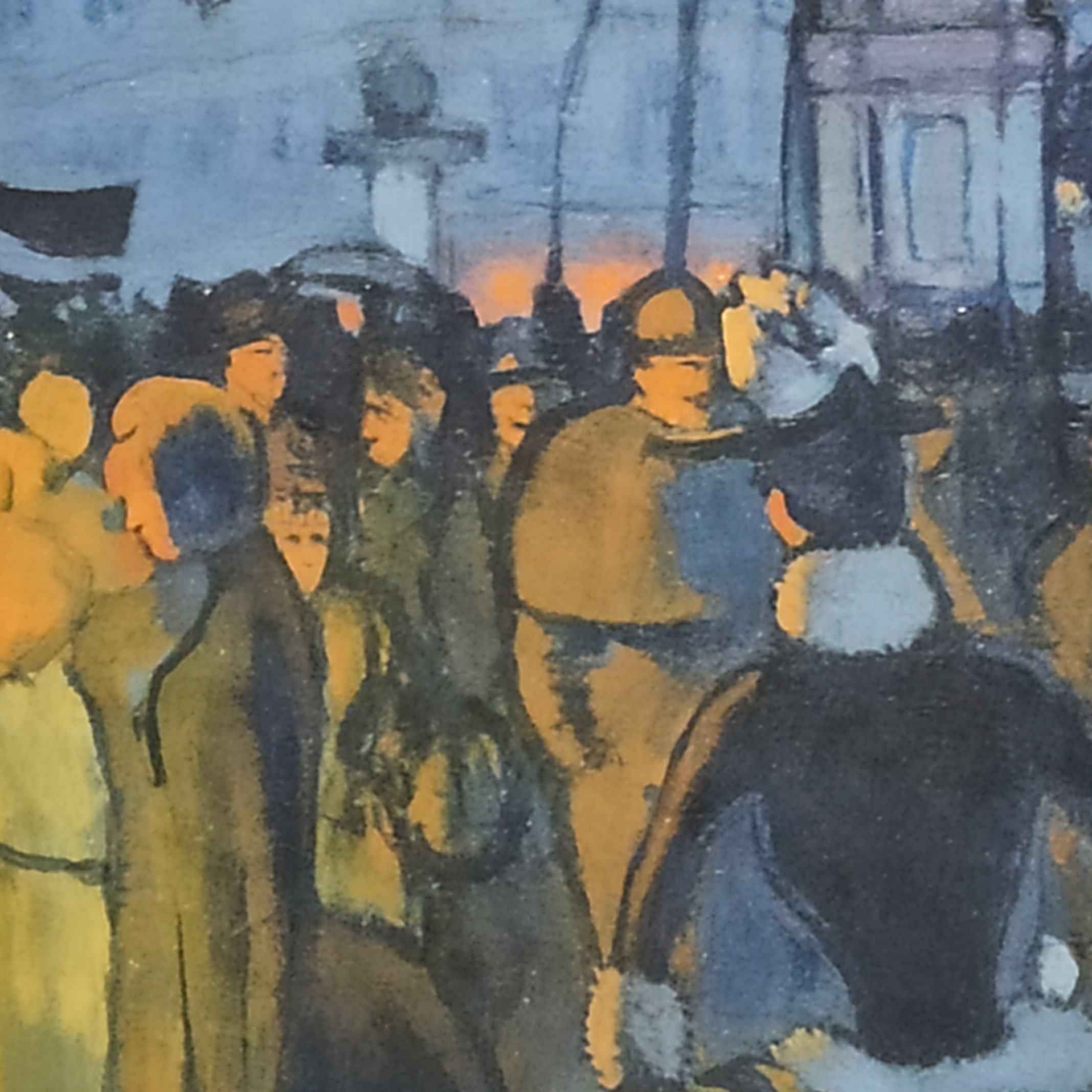
Avenue de Clichy: Five O’Clock in the Evening by Louis Anquetin (1887)

Wow!
What an atmosphere and mood that’s captured of a contemporary Parisian street. For me, I like the wet and humid atmosphere of the street against the artifical light of the lamps and the shop window.
Anquetin moved to Paris in 1882 to receive an education in art; and became friends with van Gogh, Toulouse-Lautrec, and Bernard. It seems he had an influence on Gauguin.
In this painting, there are a limited number of vivid colours; and it is reminiscent of the Japanese block prints (which influenced the impressionists) and the ‘simplified’ life they capture. Hence, the simplified forms - silhouette-like - forming a throng of Parisians going home after work.
 |
| The light infiltrating everything. |
✲✲✲
The Pardon, Breton Women in a Meadow by Emile Bernard (1888)

Interesting.
As noted by the gallery; this painting is reminiscent - in style - to Gauguin’s ‘Vision of the Sermon’.
Both involve the traditional Breton dress against an abstract non-naturalistic background. In this case, green. Most of the faces are vague with scarcely any detail; and either turned against the viewer or hideously contorted. It feels quite modern.
Ghastly face but also a cute little girl in the background.
✲✲✲
Tristan Bernard at the Vélodrome Buffalo by Henri de Toulouse-Lautrec (1895)

I like it.
Dedicated to the playwright Tristan Bernard who was his friend. Shown standing and looking into the distance.
Racetrack around him. Believe it or not, there are two race-trackers racing in front of him. They’re faintly painted to give effect to their whizzing blurry speed; and the power of modernity.
✲✲✲
The Reader by Henri de Toulouse-Lautrec (1889)

Marvellous. I was amazed by this in the gallery.
This sitter is Hélène Vary. He painted her with such tenderness and delicacy - and with few hues. I also really love how the greenish curtains really contrast with the rest of the room and highlight Vary, and her gorgeous hair.
I like the delicate folds and finish of her white clothes. I love how her immense and bulky buoyantly-rich brunette-rusty hair is counterposed by her demureness and her reserve.
According to the gallery:
Since he was independently wealthy, he could select his sitters-in this case a 17-year-old neighbour, Hélène Vary, who sat for him some four times. Using his characteristically ‘drawn’ painting style and a reduced palette dominated by white and turquoise, he depicts Vary in her chemise with her hair loose.
Amazing painting. It really grabs your attention. I did a google search of Helene Vary and there exists actual photos of this lady. So, she is immortalized forever in Toulouse-Lautrec’s paintings.
✲✲✲
Lugné-Poe by Édouard Vuillard (1891)

This painting grew on me. Initally, I felt like something was missing ... and then I realized how wonderful it is.
I love the angle it is painted (as if we’re at head-height), and I like the way the Vuillard has painted the hunched and engrossed body of his old friend (Lugné-Poe). There is a sweet tenderness to the painting.
I love the limited palette of colours which, I think, intensifies the subject - is that a black shirt?
✲✲✲✲✲
Room 4 - The Nabis Group
✲✲✲
- In 1888, Gauguin’s non-naturalistic style inspired a group of young artist artists.
- They called themselves Nabis (Hebrew = ‘prophets’).
- Their work explored the abstract potential with highly patterned decorative styles.
- Include:
- Paul Sérusier
- Maurice Denis = mystical Catholic-inspired family scenes.
- Pierre Bonnard & Edouard Vuillard = intimate domestic interiors with patterned fabrics, wallpapers and lamp-light.
✲✲✲
Figures in an Interior: Music by Edouard Vuillard (1896)

Highly ornate & decorative. Beautiful carpets, piano, flowers, tapestry etc.
I also like how the piano player is focused on the reading the music sheets, and two friends watching from behind. Lovely.
According to the gallery, this was supposed to decorate the private library of a Parisian cardiologist. I think there is something Japanese influence with the plush flowers against the background wall, and the from the vase.
✲✲✲
Madame Claude Terrasse and her son Charles by Pierre Bonnard (1893)

What a cute baby. Makes you smile.
The two-dimensional surface is made clear by the flattened patterns on the mum’s dress. The abstract swirling greenery matches the highly decorative patterns on her clothes.
According to the gallery:
He also employs gentle humour in depicting the baby’s expression and the awkward pose of his mother as she attempts to keep him on her lap.
✲✲✲
Young Woman by Lamplight by Pierre Bonnard (1898)

I like this painting a lot. It feels quite modern.
I especially like the darkened, subdued and dimly-lit atmosphere against the lemony-yellow lampshade at the centre of the painting. It feels like a quiet home in the late hours.
The woman suing at the fore, and two people chatting in the background by another lamp. Some leaves of a plant in the back, and an ornate plate on the table.
As per the National Gallery:
Bonnard’s fascination with scenes of domestic family life marks his paintings ... during the 1890s and herald his move away from Nabis stylisation to a modified form of naturalism from 1900.
So, this painting marks the ending flirtation of Bonnard with Nabis.
✲✲✲
The Talisman, Landscape In the Bois d’Amour by Paul Sérusier (1888)

This painting is important to Les Nabis. It was painted directly under Gauguin’s guidance in the fall of 1888. To me, I see our modern abstraction.
According to the National Gallery:
This little picture, and the story of its origin, took on a mythic quality when Sérusier returned with it to the group of artist friends who subsequently became the Nabis (Prophets).
In this painting, we see exaggerated and vivid colours at the expense of the details of naturalism. It is not totally abstract. E.g. we can see some “semi-abstract” are reflected in the water at Pont-Aven. The forms are simplified and the decorative vivid colour takes supremacy.
✲✲✲
The Apple Harvest by Paul Sérusier (1891)

Interesting. I am not sure whether I really like this.
Reminiscent of a religious medieval triptychs, this painting uses similarly saturated colours and that pre-Renaissance flattened depiction of young women picking apples.
As per the National Gallery:
Like so many artists who visited Brittany, Gauguin and Bernard included, Sérusier perpetuated perceptions of the Breton way of life as ‘innocent, idyllic and somehow more ‘authentic’ than modern urban living. Such mythologies led Breton culture to be described among these artists as ‘primitive’ - a now acutely controversial term - that they deemed a form of praise.
✲✲✲
Island and Village of Le Pecq by Maurice Denis (1891)

Interesting, and quite beautiful.
Denis painted this brumal view across the River Seine.
Once again, a limited - but vivid - palette with stylized rows of homes on a flattened surface with little depth.
 |
| I love the faint detail of a person rowing which makes the river green. |
✲✲✲
The Evening Wash, by Lamplight, or Motherhood at Le Pouldu, Evening Effect by Maurice Denis (1899)

I quite like this.
It seems Maurice Denis was a Catholic and immersed his artistic scenes with some religious meaning. According to the gallery, this painting depicts his wife and daughters (and his sister-in-law) in the classical Renaissance of the Virgin and Child with Saint Anne and Saint John the Baptist.
However, the simplified colour palette and patterned and decorative dresses and sea retain the Nabis elements of non-representation.